Background
Although as a data scientist, there is still a high chance that your job content won't be entirely about building machine learning models. In fact, there are many questions and issues you are trying to solve daily that don't require machine learning.
You need to work like a data analyst and a subject matter expert by digging into the root cause of those issues, have an argument, figure out how and where to find evidences to support your argument. This process involves transform business problems into technical and functional specifications, find data and study the available data.
Essentially, you are using various data analytics and data mining techniques to answer business questions and most importantly you need to present your findings professionally and clearly.
Tools used
There is a great selection of Buiness Intelligence (BI) tools available in the market that can help you end-to-end from data understanding to exploration to analysis to visualizations in a fast and reliable way.
Depending on your team and company, there could be different BI tools available to choose from. The one I chose for this demo and used extensively for my past projects is called Tableau. It comes with handy features that can pretty much answer to all your needs in analysis and visualization and it also has quite a large community where you can learn and exchange ideas with fellow like-minded individuals. For more details about Tableau, you can search it up on Google.
To increase my productivity and to demonstrate the advantages of different analysis tools, I also used Python in this project. How I plan to use both tools:
Tableau: Data Understanding, Exploration and Visualization
Python: Data Cleaning, Manipulation, and Modelling
About the dashboard
Data
The dataset I used to build this KPI dashboard comes from a data challenge for a job interview, but I have done some altercations to keep it more relevant to my case. This data includes information on number of searches performed on a digital platform (our target product), and subsequently if these searches resulted in appointments made with the provider.
Moreover, users can find useful information about different service providers such as details of the service avaiable, hours of operation...etc on this platform and decide if they want to book an appointment.
As a company who owns this platform, the objective is to study the behaviors of the users by leveraging the power from data analysis and data science which ultimately drives up the platform traffic, and user stickiness.
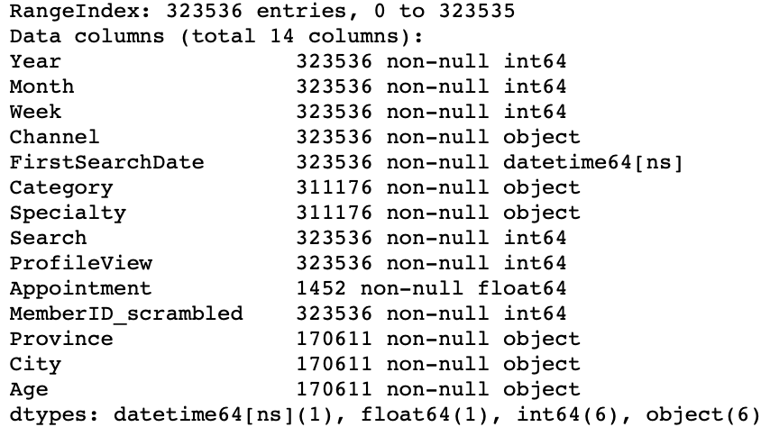
There are 323536 lines of search records and 14 relevant attributes that define those search records.
An example of our data

Some important information about the data

Our Objective:
- Based on the data, what do we know about this product/platform?
- What project ideas and business initiatives that we can give to the management to help to bring more value to the users while maximize our gains at the same time?
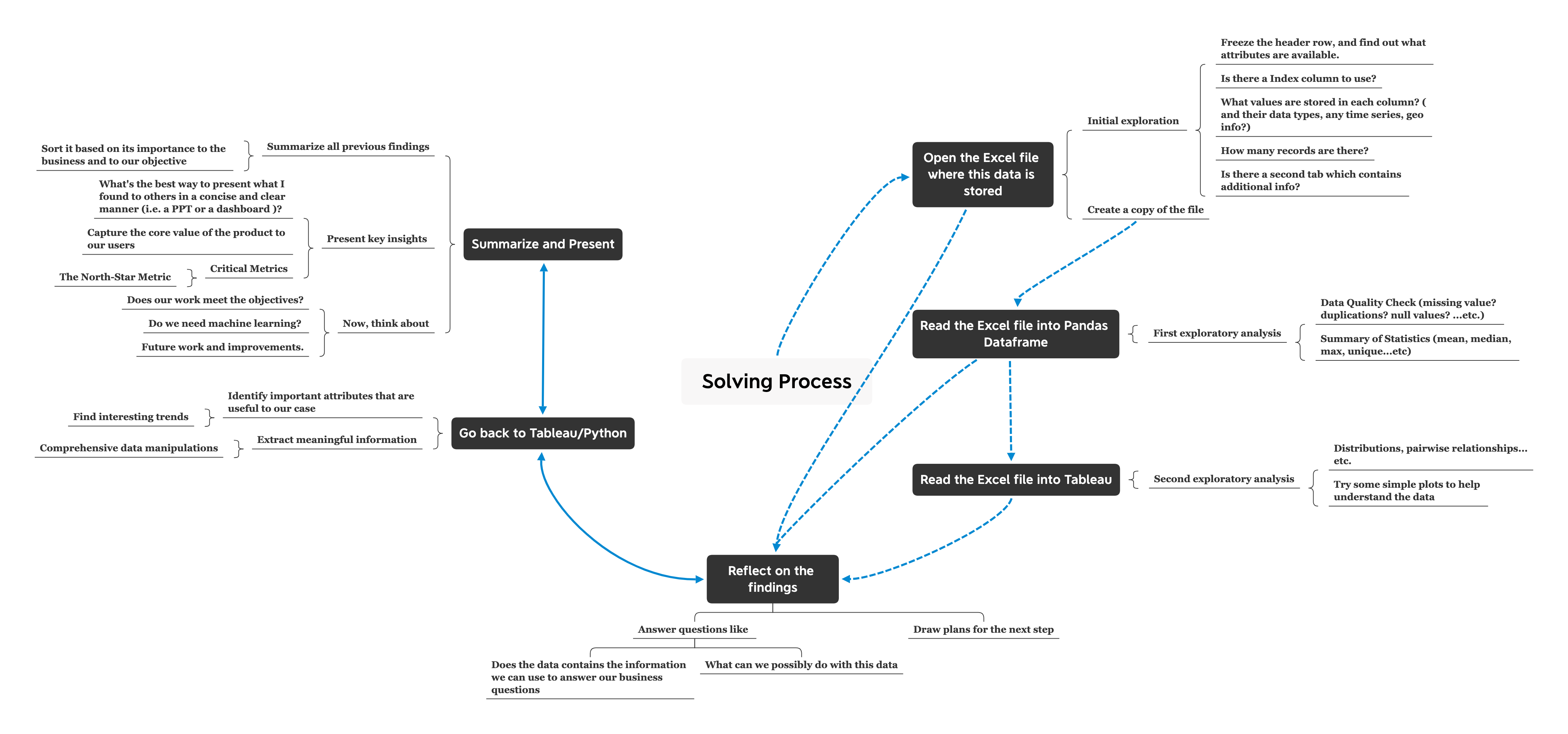
Solving Process:

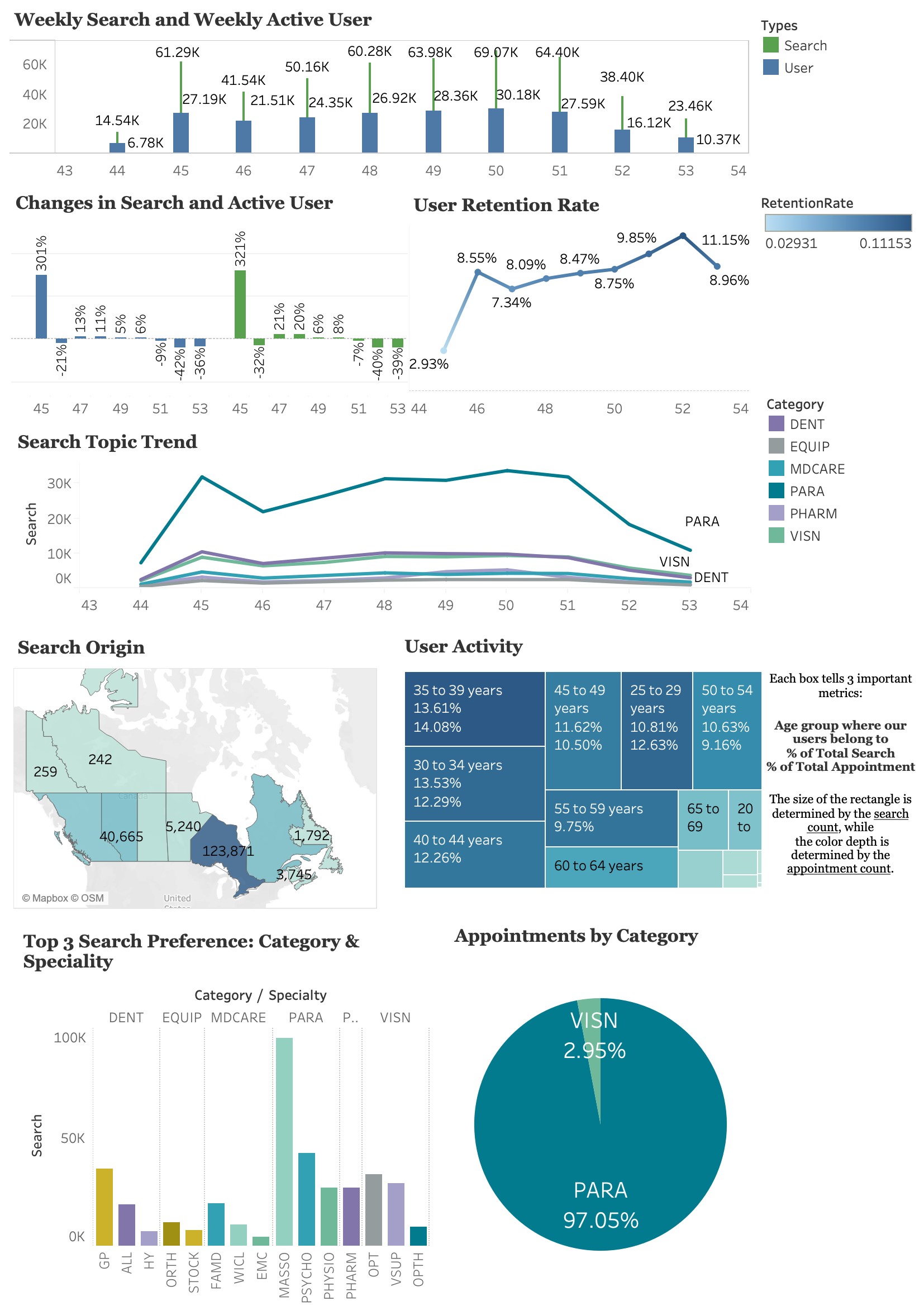
What do we get now?

Future Work:
This is the end of "Building a KPI Dashboard From Scratch Project Demo Part I". In this post, I provided an overview of this project including the background information and objectives we aimed to achieve.
In the future post, I will walk you through my thinking process and the detailed steps I took to build above shown dashboard. I will also explain why I chose to include these plots in the dashboard but not others.
